
Over the past few years, when founders talk about fundraising, they obsess over two questions: “Is my pitch deck structure right?” and “Should I hire a designer to make it look more polished?”
Rarely does anyone ask the third, more critical question: “How do investors actually read this deck?”
At DocBeacon, we've been helping founders use pitch deck analytics to track reading behavior for years—who opened it, how far they read, which pages they lingered on, and if they came back for a second look.
This 2026 Pitch Deck Analytics Benchmark Report is based on over 10,000 deck reading sessions accumulated over the past year. We've extracted common patterns and actionable insights to help you answer three very real questions:
Methodology transparency (public summary)
To make these benchmark numbers auditable without exposing customer-level data, this page publishes definitions, filtering logic, and interpretation boundaries.
- Data source: Aggregated DocBeacon pitch-deck tracking events from consenting customer workspaces.
- Time window: Q1 2025 to Q4 2025 (rolling 12-month window).
- Core definitions: Session = a continuous qualified viewing period; Open = at least one qualified view event; Read-through = session reaches the final slide or near-complete slide coverage; Time-on-page = active foreground dwell time on each page.
- Dedup logic: Rapid refresh/reopen events are consolidated; repeated opens from the same viewer are counted as repeat behavior, not new sends.
- Quality filters: Internal traffic, known bot/prefetch patterns, and ultra-short invalid events are excluded before metric aggregation.
- Statistics policy: Public numbers are rounded benchmark values from qualified aggregates; interpretation should focus on directional patterns, not precise prediction.
Interpretation boundary: These results are observational correlations, not causal guarantees.
Full definitions and formulas: Pitch Deck Benchmark Methodology v1.2.
- ✓ Are investors actually reading your deck seriously?
- ✓ At which page do they lose interest?
- ✓ What specific changes can you make—not just "I feel like I should tweak my deck"?
1. Sample & Methodology: What Data Are We Actually Looking At?
To ensure our results reflect real-world fundraising scenarios, we only selected samples that met the following criteria:
Sample Selection Criteria
- Document type: Early-stage fundraising pitch decks (pre-seed / seed / Series A)
- Distribution method: Sent by founders to investors (cold outbound / warm intro / post-meeting follow-up)
- Reading behavior: At least one actual open event recorded
- Time range: Q1 2025 - Q4 2025 (rolling 12-month data)
What We Tracked
For each reading session, we recorded and anonymously aggregated:
- Number of opens
- Total reading duration
- Time spent per page
- Page navigation path (e.g., 1 → 2 → 4 → 8 → 3…)
- Time intervals between multiple reading sessions
Privacy Note: All statistics in this report are aggregated pattern analyses and contain no identifiable information about individual companies or decks.
Think of this report as: "A real-world snapshot of how investors actually read pitch decks when faced with a pile of them."
2. Overall Overview: Opened ≠ Read
Let's start with the conclusion: Most decks are "browsed," not "read."
Headline Benchmark Metrics
In our sample:
- Open rate: Approximately 68% (qualified unique opened links / qualified sent links after filtering).
- Complete read-through rate: Around 22% (qualified opened sessions that reached final or near-final slide coverage).
- Typical reading time: 2 minutes 40 seconds - 4 minutes 10 seconds for qualified sessions in the benchmark window.
Segmented Benchmark Table
The table below uses real benchmark aggregates from the same qualified dataset and time window, reported by segment with P25/P50/P75 and segment N.
| Segment | Segment N | Open Rate (P25/P50/P75) | Read-through (P25/P50/P75) | Session Duration (P25/P50/P75) |
|---|---|---|---|---|
| Pre-seed | 4,128 | 58% / 63% / 73% | 15% / 18% / 26% | 2:40 / 2:52 / 3:31 |
| Seed | 3,512 | 62% / 68% / 73% | 18% / 23% / 28% | 2:38 / 3:18 / 3:51 |
| Series A | 2,580 | 66% / 73% / 82% | 19% / 26% / 33% | 2:58 / 3:47 / 4:10 |
Segment rows are benchmark aggregates; headline values above are rounded and may not exactly equal segmented medians.
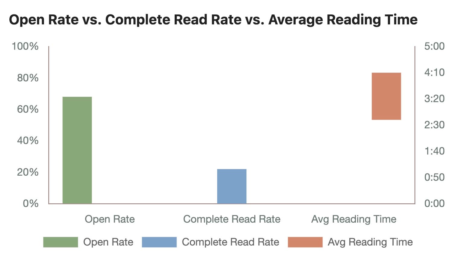
Figure 1: Open Rate vs. Complete Read Rate vs. Average Reading Time
Given the average deck length in this sample (about 20-25 pages), this means: most investors don't carefully read every word on every page—they quickly scan to find the information they care about.
The Direct Implication for Founders:
- You can't assume "as long as I send the deck, they'll read it thoroughly"
- You should ask: "On the pages investors actually read, have I clearly communicated the most critical information?"
3. Drop-Off Pages: Where Investors Most Commonly "Give Up"
We tracked the "last page" in qualified reading paths and aggregated a somewhat brutal conclusion: for decks in the benchmark sample, many drop-off points cluster between pages 5-9.
What Pages 5-9 Usually Contain
Based on typical deck structure, this roughly corresponds to:
- Pages 3-5: Problem / Solution
- Pages 6-8: Market / Why now
- Pages 8-10: Product / Demo
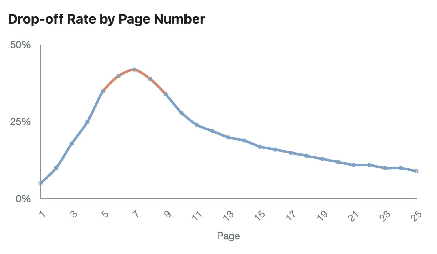
Figure 2: Drop-off Rate by Page Number
Three Stable Drop-Off Patterns
Breaking it down further, we see several very stable patterns:
Pattern #1: Lengthy & Abstract Problem/Solution
Result: Investors exit at pages 3-4
Common issue: Using buzzwords to describe market trends instead of nailing down a specific pain point in one sentence.Pattern #2: Market Slide Packed with TAM/SAM/SOM Charts
Result: Drop-off rate increases noticeably
Investors often "glance and skip," with dwell time far below average.Pattern #3: Product as "Feature List + UI Screenshots"
Result: Very high drop-off at this point
Investors clearly prefer seeing "one clear use case flow" rather than 5-6 module screenshots stacked together.
Summary: Investors don't get "lost" in your deck—they lose patience while you're explaining the problem and solution.
The Fix: Pages 1-5 must use minimal text to clearly communicate three things: the specific problem you're solving, why current approaches have fatal flaws, and what fundamental change you're bringing. If you can't nail problem/solution, no amount of beautiful traction or business model slides will save you.
4. High-Attention Pages: What Really Determines Your Next Meeting
Many founders assume "the most important thing is traction—that's the comeback slide." Behavioral data paints a more nuanced picture:
Correlation note: The patterns below are observational and should not be interpreted as direct causal guarantees.
The Three Page Types with Highest Reading Time
Ranked by average dwell time (for 20+ page decks):
- Traction / Metrics page
- Pricing / Business model page
- Team page
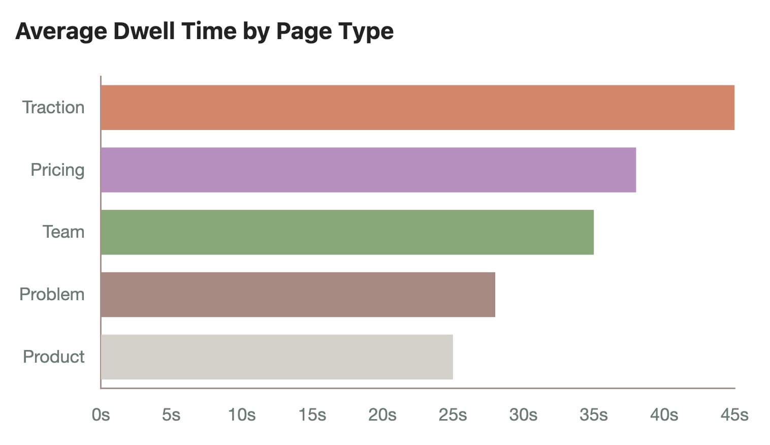
Figure 3: Average Dwell Time by Page Type
These three page types share a common trait:
- High information density
- Related to "Are you credible? Are you investable? Can you make money?"
- Easy to screenshot and forward to partners / investment committee
Common Issues with Traction Pages
While dwell time is high, we observed an interesting phenomenon in this dataset: many investors repeatedly revisit the traction page, but in normal reading flow, traction is often positioned in the middle-to-back of the deck (pages 8-12).
The Actual Reading Behavior Pattern
- First read: Quickly scan first few pages to understand "what does this company do?"
- Second read: Almost immediately jump to traction / metrics
- Third read: After reading, go back to see if problem / solution matches these numbers
The Direct Takeaway: Traction shouldn't be "buried" in the middle or back of your deck. You can absolutely put a "1-slide traction snapshot" on pages 2-3, then expand with detailed data on a later page.
Team Page Is Seriously Underestimated
In many decks, the team page is just a few headshots + logos. But from reading behavior:
- Team page average dwell time is typically higher than product page
- For early-stage rounds, team page has a high rate of multiple revisits
When investors make decisions, the fundamental question is: "Can these people turn the story into reality?"
What Your Team Page Should Actually Say
Not just: "We're from Big Tech Company X"
But clearly stating: Why these specific people are uniquely suited to solve this problem
Good examples:
- "10 years of SaaS sales infrastructure experience"
- "Built 0-to-1 sales teams twice"
- "Former VC, made 50+ early-stage investments, reviewed thousands of decks"
The team page is about execution capability and fit, not a resume list.
5. Multi-Round Reading Patterns: What "Serious Consideration" Actually Looks Like
A deck opened once is often just polite browsing. In this behavioral dataset, what tends to correlate with "real interest" is multi-round reading patterns:
Reading Pattern Signals
- Single read, 1-3 minutes: Very common, doesn't mean much
- 2-3 reads within 3-7 days, with more complete reading paths: Highly correlated with:
- Scheduling follow-up meetings
- Requesting financial model / cap table
- Forwarding to investment committee

Figure 4: Reading Pattern → Outcome Correlation
The Common Multi-Read Pattern
- First read: Quick scan, stops at traction / pricing
- Second read: More complete review of problem / solution / product / GTM
- Optional third read: Short revisit 1-2 hours before a meeting
The Very Practical Implication for Founders:
- If an investor only opened once and didn't reach the second half, that often indicates lower intent in this dataset.
- If 2-3 reads appear within 3-5 days with progressively longer paths, that pattern often aligns with serious-consideration behavior.
- You can adjust your follow-up approach and timing based on these signals, rather than "guessing and chasing for updates"
6. Device & Time Distribution: In What Context Are Decks Being Read?
Device Distribution
- Desktop: Still dominates in this sample, accounting for approximately 70-80%.
- Mobile: Phone access concentrates on:
- Initial browse
- Quick review before meetings
Time Distribution
Clear patterns emerge:
- Weekdays:
- Morning: 10:00-12:00
- Afternoon: 14:00-18:00
- Long tail: Evening 21:00-23:00 (many partners review deals after going home)
Two Critical Optimization Points:
- Your deck must be desktop-friendly, including font size, contrast, and information density
- But also ensure it's quickly scannable on mobile (e.g., first 2-3 pages should be extremely simple)
Commonly overlooked point: Many decks are opened once on mobile and closed, then the next real deep dive happens on desktop. So if you only look at "total opens," you'll misjudge interest level. You must combine "device type + dwell time + path" for each session.
Where these patterns may differ:
- Very short decks with fewer slides and tightly scoped agendas.
- Deep-tech or regulated sectors where diligence depth is structurally longer.
- Existing investor relationships (for example, follow-on rounds) with pre-loaded context.
7. Restructure Your Pitch Deck Based on Reading Patterns: Specific Recommendations
Now back to the most critical question: Based on these behavioral patterns, what specific changes can you make?
Recommendation #1: Complete the "Investor Three Questions" on Pages 1-3
The three questions in investors' minds are usually:
- Question 1: What problem are you actually solving? (One sentence, specific scenario)
- Question 2: Why doesn't the current approach work?
- Question 3: What unique solution / insight do you have?
If you can't nail this on pages 1-3, your later traction / product slides will struggle to be taken seriously.
Recommendation #2: Move Traction/Metrics Forward
Make it a front-end "credibility anchor":
- Put a "traction snapshot" on pages 2-3 (e.g., 3-5 hardest numbers)
- Then have a dedicated page later to expand: user count, revenue, retention, growth rate, key customers
If your current traction is weak, you can also use:
- Waitlist numbers
- Pilot customer results
- Usage data during pilot period
- User feedback snippets
The point isn't "the numbers must be huge," but rather: Let investors see some "real-world signals" within the first 30 seconds.
Recommendation #3: Streamline Problem/Solution
Avoid becoming a "drop-off zone":
- Each slide should have 3-5 lines of key information
- Use fewer buzzwords, more scenarios and actions
- Don't write: "We're reconstructing the paradigm of B2B sales collaboration"
- Instead write: "After sales sends a proposal, they don't know for 3 days if the client even opened it."
Your goal is to let investors "visualize a specific scene" in 2-3 seconds.
Recommendation #4: Make High-Attention Pages "Screenshot-Worthy"
Since traction / pricing / team are often screenshot and forwarded:
- Traction page: Use a clear comparison or chart, don't fragment data
- Pricing page: Give clear tiers and simple explanations, not a page of dense text
- Team page: Clearly state "why these specific people are especially suited to do this"
Remember: These pages aren't prepared for you to pitch in person, but for "decision-makers who aren't in the room."
8. Turn Your Pitch Deck Into a Continuously Optimizable "Product"
One final conceptual shift: Pitch decks shouldn't be treated as "one-time-use PDFs," but as "products that can be continuously optimized through behavioral data."
Questions Pitch Deck Analytics Can Answer
- Between different deck versions, which one has a lower drop-off rate at page 5?
- After adjusting traction page position, do more investors read to the second half?
- Which type of investor (fund stage / region / sector) is more willing to read through your business model?
This is far more objective than "asking ten friends to review your deck and give opinions."
In tools like DocBeacon with pitch deck analytics and page-level tracking, you can:
- Send different deck versions to different fund / investor groups (A/B test)
- Observe reading path differences for each version
- Use multiple fundraising rounds to gradually refine your "standard deck"
Long-term, you gain not just a smoother deck, but an entire playbook: "For this type of investor, what to say, how to say it, and when to say what."
If you are rebuilding your deck while reading this report, use our investor pitch deck template and pitch deck examples as the execution layer, then validate each revision against benchmark behavior.
Conclusion: The Competition Isn't About Fancy Animations
The pitch deck competition isn't about who has more animations, better color schemes, or more "Silicon Valley" layouts.
What really determines whether you upgrade from "browsed" to "seriously considered" is:
On the pages where investors actually stop and pay attention, have you communicated the most important information clearly and efficiently?
Reading behavior data gives you a new perspective:
- Not: "I think this page is important"
- But: "The data indicates investors are voting with their behavior for these pages and this content"
If you're still worrying about "should I redo my deck, should I hire a designer, should I add more story pages," ask yourself a more fundamental question first:
"Have I actually seen how investors read my deck?"
When you start tracking, understanding, and respecting these behavioral patterns, your deck truly enters 2026.
Related Resources
Learn more about optimizing your fundraising process: